
There is something almost surprising about watching a tiny baby become completely absorbed by a few black lines on a white card. To us, the image can look almost too simple. To a newborn, it may be one of the clearest things in the room. That is the idea behind high contrast baby cards: simple visual images that are easier for an immature visual system to notice. But not every black-and-white card needs to be a cute panda, and more cards do not necessarily make a better set.
The interesting question is not simply “Do babies like black and white?”
It is: What makes a high contrast card worth looking at?
What are high contrast baby cards?
High contrast baby cards are images made with strong differences between light and dark, usually using black and white shapes or patterns. They offer young babies something clearly defined to look at while their vision is still developing.
A newborn sees the world quite differently from an adult. Fine details and subtle differences between shades are harder to distinguish, while larger shapes with strong contrast are easier to detect. Researchers have studied how newborns respond to different visual patterns and measured their sensitivity to contrast. These findings help us understand why a simple black-and-white image may be easier for a young baby to notice than a colourful illustration filled with tiny details. You can read more in this research on newborn visual acuity and contrast sensitivity.
This doesn’t mean babies see only in black and white. Their colour vision is developing too, but strong contrast makes certain visual information easier to notice during the earliest weeks. This is why black-and-white cards and other high contrast visual resources are often introduced during the newborn months.
Of course, being able to see a pattern more clearly doesn’t mean a baby will always find it interesting. And that’s where choosing the cards becomes a little more thoughtful.

What makes a good high contrast baby card?
If you’ve been looking for black-and-white baby cards, you’ve probably noticed how many different sets are available. Some contain a handful of geometric patterns, while others offer 40, 80 or even 100 illustrations, often featuring animals, faces and familiar objects. It’s easy to be drawn to the larger collections, especially when the illustrations are lovely. But I kept coming back to one question: what is the baby actually looking at?
A newborn doesn’t yet recognise a drawing of a zebra as a zebra. What they can begin to notice are the contrasting areas, edges, curves and shapes that make up the image. This distinction is interesting because it changes how we think about designing cards. Instead of asking whether an illustration is attractive or recognisable, we can consider the visual experience it offers.
Research into newborn visual preferences provides some useful clues. For example, an early study of newborn responses to curved and straight contours found differences in how long babies looked at particular shapes. That doesn’t mean curved patterns are always preferable, or that every card should contain circles. It reminds us that the structure of an image matters, even before a baby understands what it represents.
When choosing high contrast baby cards, I would look for clear shapes, strong boundaries between black and white, and enough variety to offer different things to observe. Broad curves, straight lines, repeating patterns and changes in the balance of light and dark can all create distinct visual experiences. It’s also worth thinking about the amount of detail. A complicated picture might appeal to us, but a simpler design can make its main shapes easier for a newborn to distinguish.
And then there’s the question of quantity. There isn’t an established ideal number of cards, and having more doesn’t necessarily make a collection more useful. A small selection of thoughtfully different patterns can offer plenty to explore, especially when you give your baby time to become familiar with each one.
When and how to use high contrast cards with your newborn
You can begin offering high contrast cards during the first weeks, whenever your baby is awake, comfortable and showing an interest in looking around. There’s no particular day you need to start, and you don’t need to prepare a new activity every morning.
Newborns tend to see most clearly at close distances, around 20–30 cm (8–12 inches). This is a useful starting point when positioning a card, although you can adjust it according to your baby’s response. The American Academy of Pediatrics has a helpful overview of how babies’ vision develops during the early months.
You might hold a card in front of your baby, position it securely beside their movement mat, or offer one during a little supervised tummy time. Start with just one image and let your baby look at it in their own time. They might become completely absorbed in the pattern. They might glance at it briefly, look away and then return to it. Or they may be more interested in watching your face. There’s no response you need to encourage. As your baby’s ability to follow movement develops, you can try moving a card slowly from one side to the other and see whether their eyes follow it. But there’s no need to turn this into an exercise or keep trying if they’re not interested.
How long should you show a card? There’s no fixed number of minutes. A brief moment of attention may be enough, particularly for a very young baby. If they look away, become unsettled or seem tired, you can simply put it aside.
You don’t need to rotate the designs according to a strict schedule, either. Babies may return to familiar patterns, and what they notice can change as their vision develops. I think this is one of the loveliest things about offering such simple materials. There is very little for us to do, which leaves more room to notice what the baby is doing.
For safety, offer cards only during supervised awake time, with the cards securely positioned and out of your baby’s reach.
Do babies really need high contrast cards?
When you’re expecting your first baby, it’s easy to feel that there must be something you should be doing to support every part of their development. And once you start looking at newborn activities, you’ll find plenty of promises about stimulating the brain, improving intelligence and helping babies reach milestones sooner. It’s understandable to want to give your baby the best possible start. But I think it’s important to separate what we know about infant vision from what these materials are sometimes claimed to achieve. Research helps explain why newborns can detect certain patterns more easily than others. It doesn’t establish that using high contrast cards makes babies more intelligent or speeds up their development.
Your baby is already surrounded by visual experiences. Your face, the light coming through a window, shadows on the wall and the movement of your hands are all part of the world they’re gradually learning to see. High contrast cards are not a necessity. They’re simply one way to offer a clear, uncomplicated visual experience.
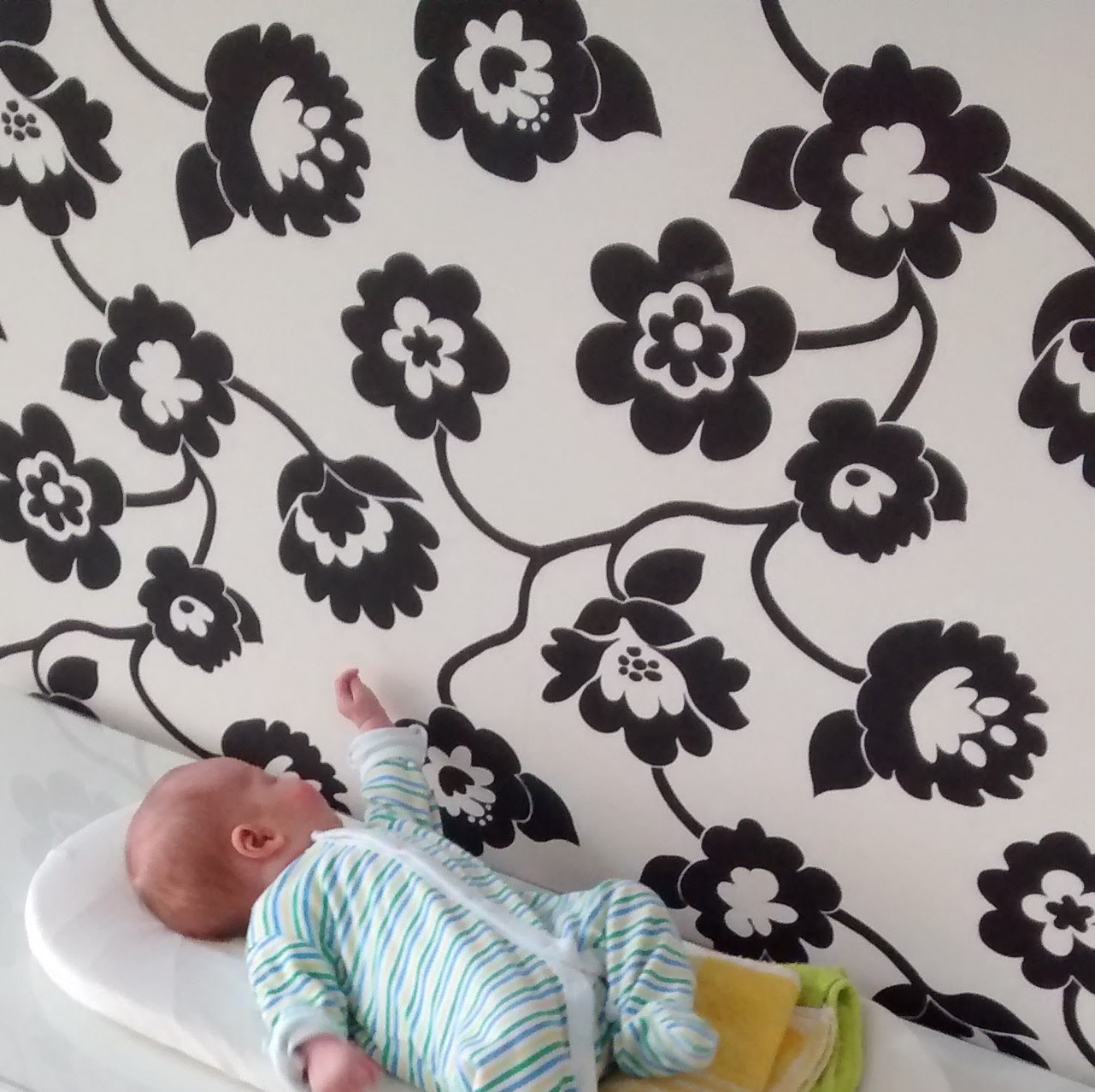
What I particularly appreciate about them is the opportunity they give us to slow down. Instead of trying to capture our baby’s attention with something new, we can sit nearby and observe. Perhaps they return to the same shape several times. Perhaps a pattern that didn’t interest them last week suddenly catches their eye. These small moments tell us something about how our baby’s attention is changing.
This is also what I value about the Montessori approach during the newborn months. It isn’t about filling the day with activities. It’s about preparing a simple environment, offering appropriate experiences and giving the baby space to explore them.
Stage 1: First Contrast — a thoughtful beginning
When I started developing my own high contrast baby cards, I wanted to move away from decorative illustrations and look more closely at the visual qualities of the patterns themselves. How does a broad curve compare with a straight line? What changes when a shape is repeated, or when the balance between black and white shifts? I enjoyed exploring these questions because they brought me back to the baby’s experience, rather than what I thought an attractive card should look like.
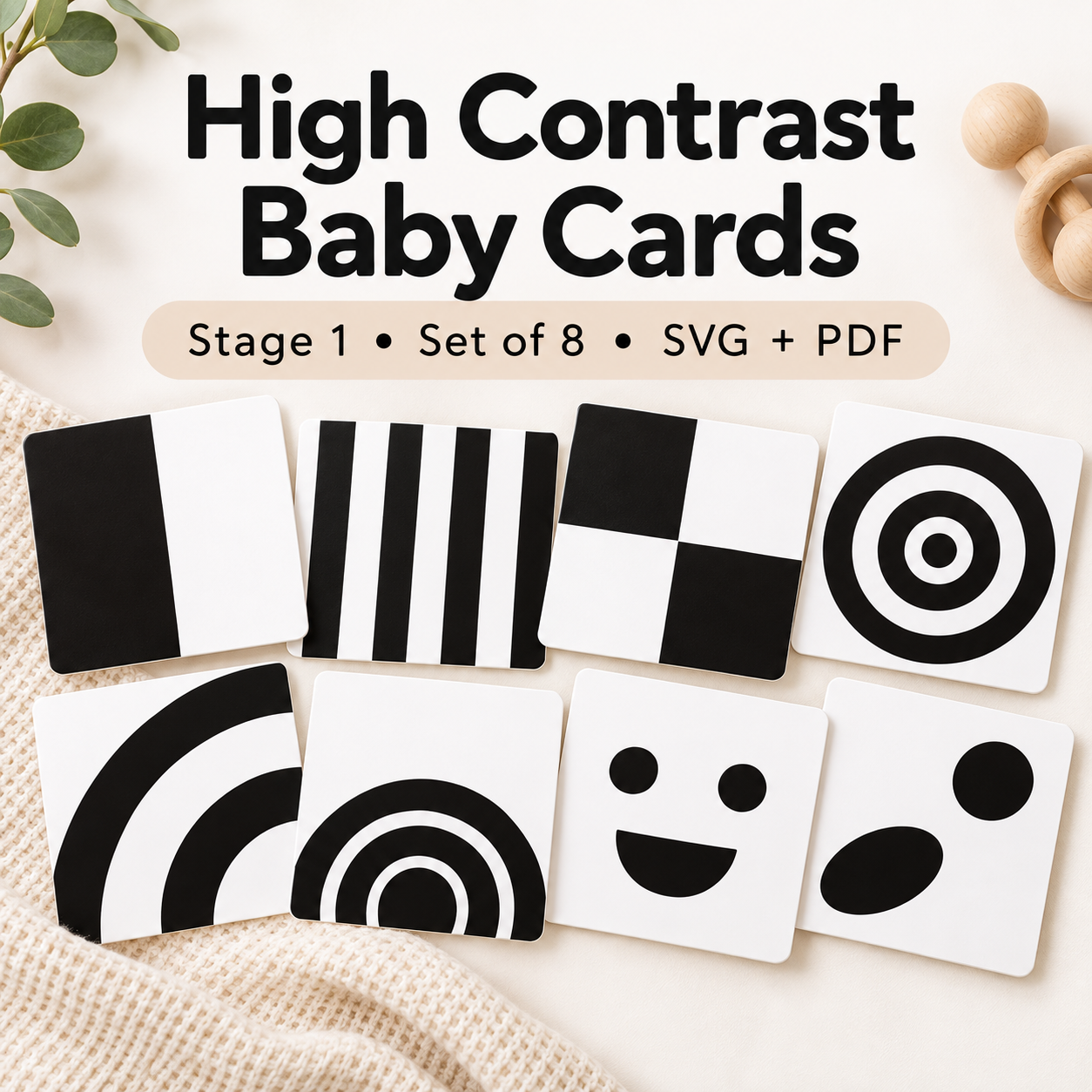
They became the starting point for Stage 1 – First Contrast, a collection of eight black-and-white designs exploring different shapes, contours and patterns. Each card is intentionally simple, but offers something slightly different to observe. I wanted the designs to have their own character without relying on unnecessary detail. The collection is available as a printable and Cricut-compatible digital set, so the cards can be prepared at home.
Stage 1 is also the beginning of a series I’m developing around the gradual changes in early visual development. Later stages will explore different visual characteristics, including colour and more complex patterns. I like the idea of a collection that changes as a baby’s visual abilities develop, but without treating those changes as a timetable that every child must follow.
For now, the first stage is simply an invitation to explore contrast, shape and pattern.
High contrast baby cards or a Montessori Munari mobile?
If you’re preparing a Montessori-inspired space for your newborn, you may have come across both high contrast baby cards and the Munari mobile. They share some visual characteristics, but offer rather different experiences.
A card is stationary unless you move it. You can offer one pattern at a time, place it securely beside the movement mat or hold it during a quiet moment together.
The Montessori Munari mobile combines black-and-white geometric shapes with a transparent sphere. Its elements move gently through the air, creating changing relationships between the shapes as the baby watches.
While the cards allow a baby to observe a single, clearly defined image, the Munari introduces gentle movement and changing spatial relationships.
I don’t think of them as competing materials. They simply offer different things to look at. You might enjoy preparing both, or you might begin with whichever feels most suitable for your space and your baby.
If you’re putting together a few simple experiences before your baby arrives, my Newborn Activity Pack also brings together ideas for visual, movement and sensory exploration during the early months. Like the cards and mobiles, these are possibilities to offer gradually, rather than activities that need to be completed.
Final thoughts
You don’t need dozens of high contrast baby cards to offer your newborn something interesting to observe.
One card on the movement mat is enough. One mobile is enough. Your face is already fascinating.
During the first weeks, your baby is getting to know a world that is entirely new to them. Things we barely notice can be wonderfully interesting when you’re seeing them for the first time. High contrast baby cards can be a lovely addition to those early experiences. They offer simple, clear patterns to explore, but there’s no need to rush through a collection or expect a particular response.
Choose a card, find a quiet moment together and see what catches your baby’s eye. You might be surprised by what they notice.
Further reading
- Montessori Baby Routine — Discover how to bring Montessori principles into everyday life with your baby, through simple routines, observation and time together.
- Montessori Visual Mobiles for Babies — Explore the Montessori visual mobile sequence and how different mobiles offer changing visual experiences during the first months.
Pingback: Creating a Montessori Baby’s Work Space at Home
Pingback: Black and White Visual Resources for Babies
Pingback: Montessori Baby Environment Guide | Montessori Edited
Pingback: Babies’ visual development in the first months